


Cross purposes: which on‑chain indicators work—and which do not
On-chain analysis is what sets the cryptocurrency market apart from traditional finance, which does not allow vast, shifting datasets to be tracked in real time.
A range of indicators offers structured blockchain data presented as charts. It can feel like a qualitatively new kind of analytics. But is it really? Oleg Cash Coin shares his view with ForkLog.
Short- and long-term holders
Once you look at the methodology and results of most on-chain indicators, it becomes clear that the blockchain itself hardly features. The outputs are, as a rule, non-standard price-based moving averages such as the Moving Average (MA). Consider the following chart:
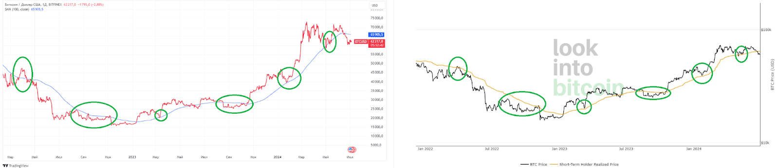
On the left is a standard 100-day simple moving average—one of the most popular. On the right is the on-chain Short Term Holder (STH) indicator: the realised price of short-term BTC holders.
STH is calculated as the average price of bitcoins that have not remained idle on-chain for more than 155 days. Coins unmoved for longer feed into the Long Term Holder (LTH) indicator.
Traders are short-term holders and have no long-term plans for bitcoin, whereas LTHs are “hodlers” not engaged in active exchange speculation.
To approximate the Long Term Holder output, a 1,700‑day period (about five years) for the SMA had to be used. Yet these moving averages are so “noisy”, given bitcoin’s huge rise, that they are only touched when the price falls two to three times from local peaks.
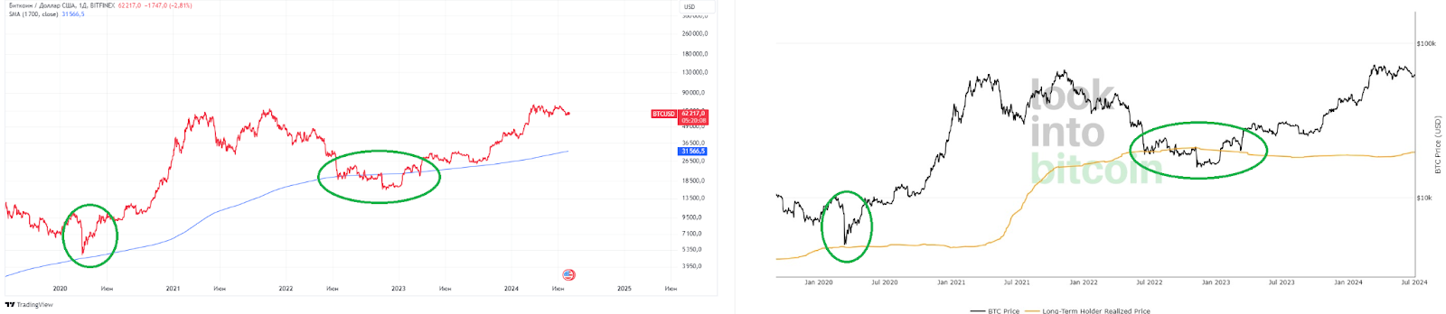
Although STH and LTH rely on different calculations from SMA, which comes from traditional finance, the charts show similar results: long- and short-term investors behave much the same.
Perhaps any indicator based on averages that brings the dollar into the methodology will end up painting roughly the same picture. Average lines smooth away imprecision anyway.
Hash Ribbons
Now consider a dollar-neutral indicator: Hash Ribbons.
The chart is based on the 30‑ and 60‑day SMA of bitcoin’s daily hashrate. When the 30‑day SMA crosses the 60‑day from above, it is deemed miner capitulation (not a sell signal). A cross from below is a buy signal.
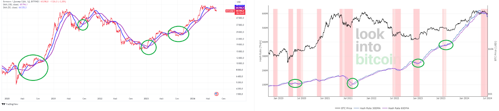
On the left is a standard bitcoin price chart with the 50‑ and 100‑day SMAs used to identify the “golden cross” and the “death cross”. On the right are Hash Ribbons.
Despite the different methodology, you will not see much difference. Likely miners are traders like everyone else. Even if they have long-term plans and some on-chain activity, the price chart already captures actions taken off exchange.
Puell Multiple
Another popular indicator is the Puell Multiple. It is notable for producing not familiar SMAs but a ratio based on bitcoin issuance in US dollars. It is calculated as the ratio of the daily value of newly mined coins to the 365‑day moving average.
Put simply, its creator, David Puell, took the 1‑day SMA and divided it by the 365‑day SMA for mined bitcoins translated into dollars.
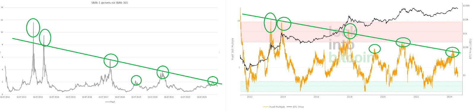
However, if we take standard 1‑ and 365‑day price SMAs and repeat Puell’s steps—adding issuance to the calculation—we find the same peaks. Indeed, even the ratio itself comes out the same. It smooths the halving moments, of course, but overall the difference is small.
Perhaps an unpopular view, but there are reasons to think some on-chain indicators merely reproduce values and ratios obtainable from a plain price chart.
Hodl Waves
The task for on-chain analysis is complicated by the fact that the first cryptocurrency has appreciated over the long term. Almost any metric, dollar-based or otherwise, will rise with bitcoin.
Slick packaging lends macro-data analytics an air of novelty and high-tech. Yet in many cases a strategy may simply rest on the premise of continuous ecosystem and price growth.
Hence the demand for fairer on-chain indicators usable for investing in cryptoassets.
For example, the Hodl Waves indicator can reveal the age of bitcoins, and thus the type of investors (holders) who appeared in specific time windows.
Hodl Waves measures the share of bitcoins as a percentage of supply and the length of time coins remain unmoved. The result is a set of waves of short- and long-term holders visible on the chart:
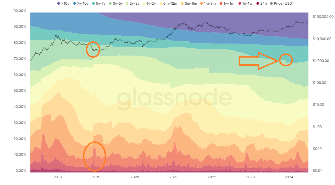
The arrow marks the step where 1.6% of BTC moved into the category of hodlers who have not moved coins for more than five years. This means the addresses holding those assets were funded in early December 2018.
Back then bitcoin traded at roughly $4,000 per coin, and the cited 1.6% of supply is more than 315,000 BTC. One may infer there are holders who kept their bitcoin all these years—neither at local peaks near $70,000 nor during stresses such as the Terra and FTX collapses, when the price of digital gold fell below $20,000.
In an optimistic scenario, those 315,000 BTC may be targeting levels above $70,000.
Thus, compared with on-chain indicators built on moving averages, tools like Hodl Waves convey far more precise information for fundamental observation.
Рассылки ForkLog: держите руку на пульсе биткоин-индустрии!